Images style guide
Horizontal images
Try to use images that are horizontal. A 16:9 proportion is a good standard that will look good (for example, 1360 x 765 px — that's twice as wide as our doc content area, so your image will keep good quality even in high resolution screens.) Also, videos embedded in Slite use a 16:9 proportion, so if you're mixing images and videos in the same doc, that will look great and consistent  .
.
.That being said, you can try other horizontal proportions that will look good as well, depending on what your image is showing. As always: content is king, and same runs for images' content.
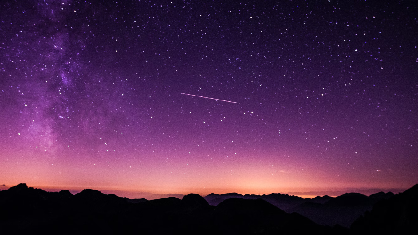
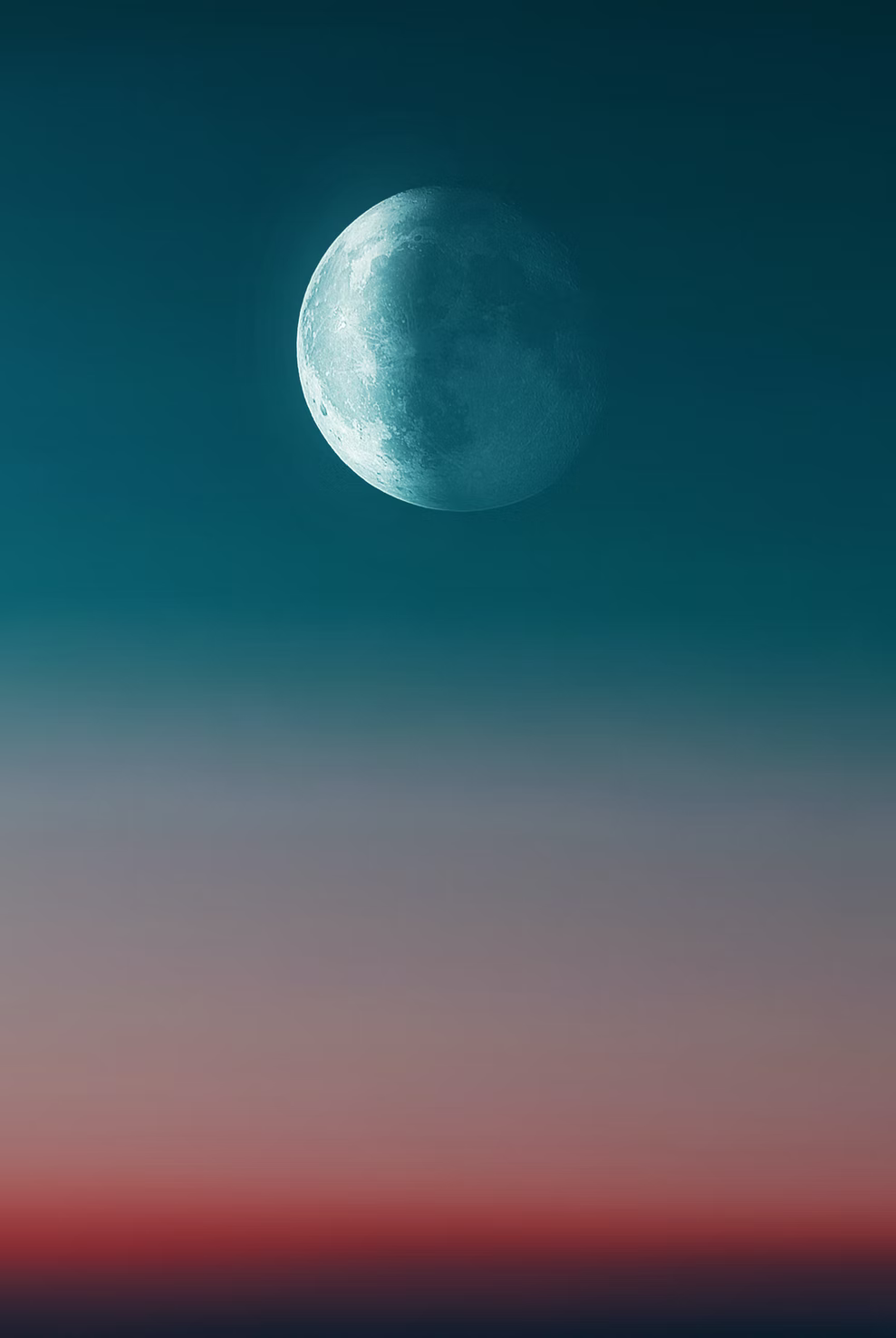
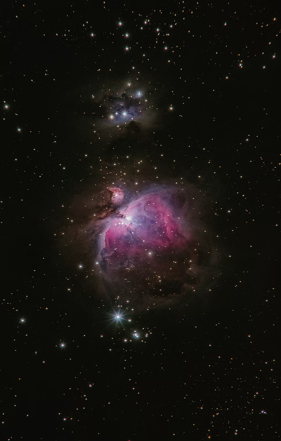
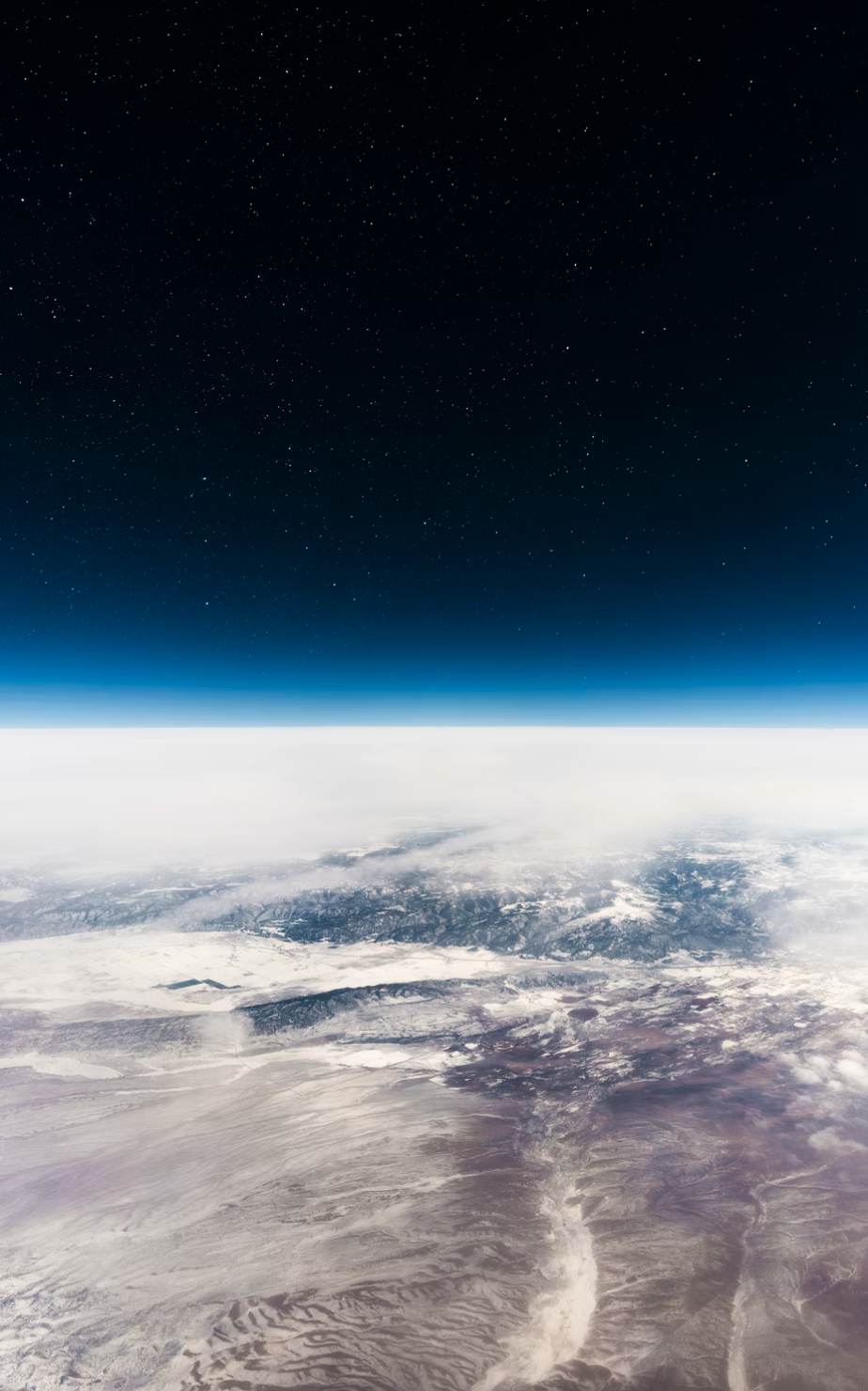
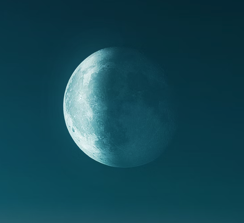
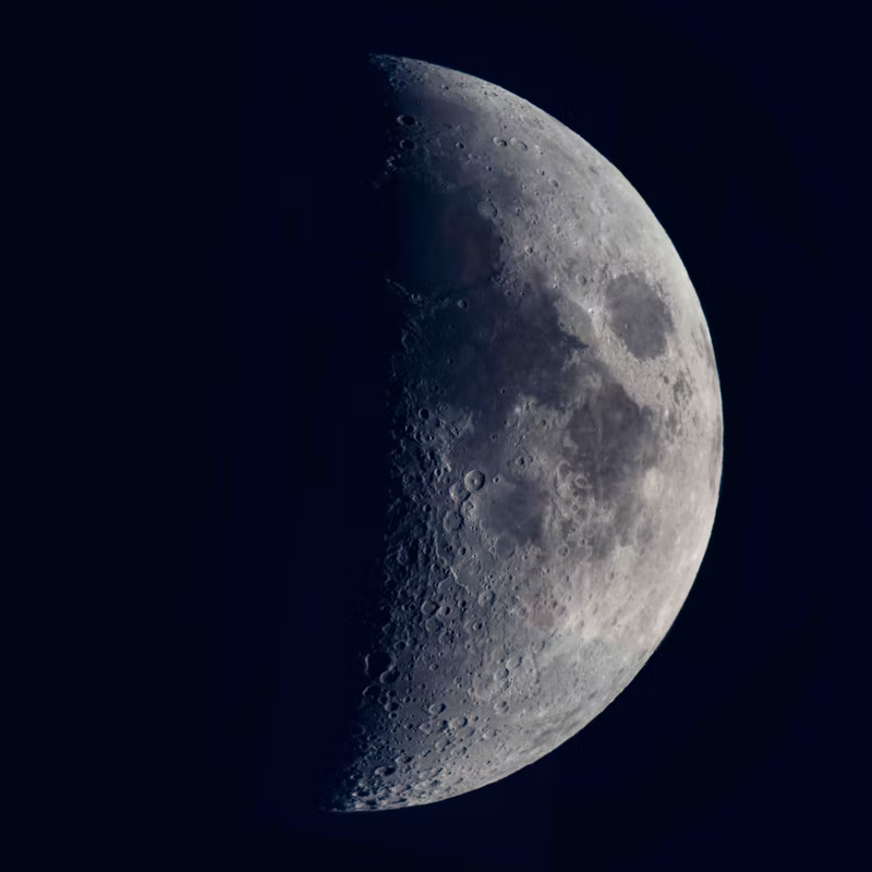
Vertical images
If you need to use vertical images, here's a tip: they look better when you create an image gallery, so the result ends up being horizontal and it fits in your computer's screen without scrolling.
NB: in our mobile app, all image galleries are converted to 1 column images (one image below the other) to ensure good visibility.
Looks better when they all have the same width, like this:


But they can also have different widths and we'll automatically adjust the height to look neat:
Squared images
Perfectly squared images usually won’t look great, since they will easily get cut off the screen like vertical ones. If you need to use a squared image, I’d recommend to resize it so it doesn’t take the full content width, and you can also center them in the middle of the doc, like here:
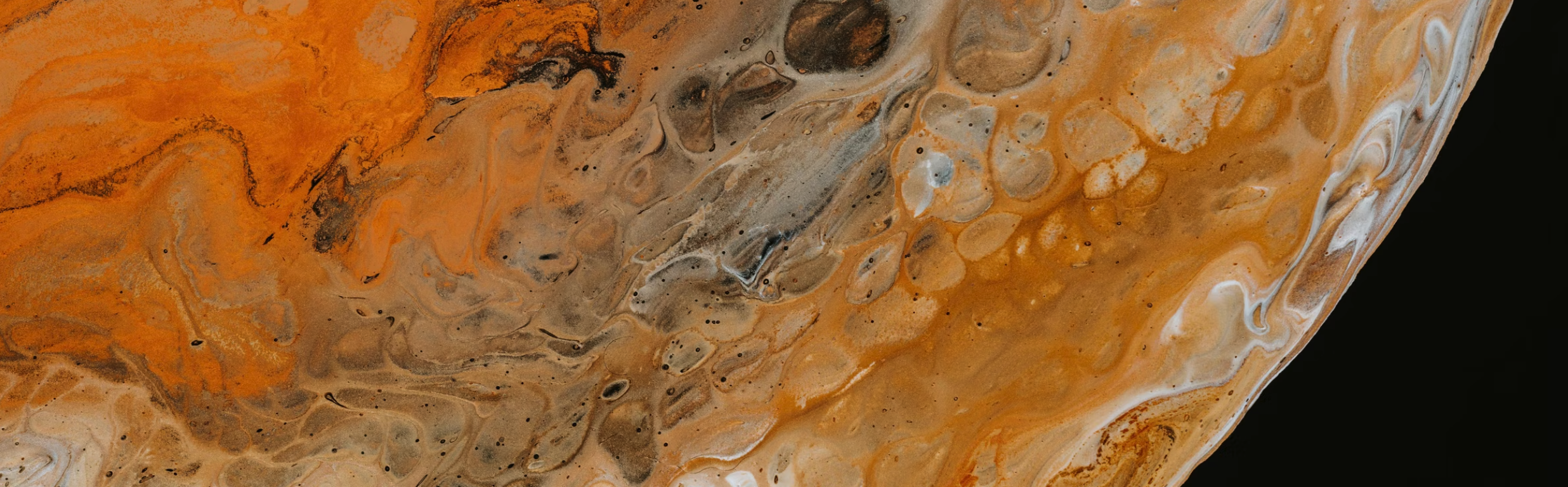
Wide images
If you want to use a very wide image (patterns and textures are great for this!), why not try making it full width? That way, proportions will be more balanced and you'll be able to appreciate more details in your picture.